The Logo
After creating the original sketch, the colors were chosen based on the colors of old electronic typewriters. These colors are the same as my mother’s electronic typewriter and are meant to bring back a form of nostalgia. For the brand multi-logos were chosen to use when appropriate for the design.
The Brand Story
For the past two to four years there has been a rise with millennials who have discovered the need to escape screens and technology by slowing down to enjoy the process of writing on the old fashioned typewriter. When I was in 3rd through 5th grade due to the reluctance of my mother to buy a computer I was forced to type reports on her old electronic typewriter. What became tedious became calming with the clicking of the keys, dinging of the bell and every so often putting whiteout over a mistake and typing over it.
The typewriter of my childhood soon became broken, keys began to stick, the cord lost and in my search to find a replacement or at least someone that could fix it I found myself going back and forth lugging this heavy typewriter around or searching for manufacturers that no longer existed. Becoming frustrated with the experience Lethe ( l-ee-th-e) was created.
App Icon / Website and Phone View
Packaging and Promotional Materials
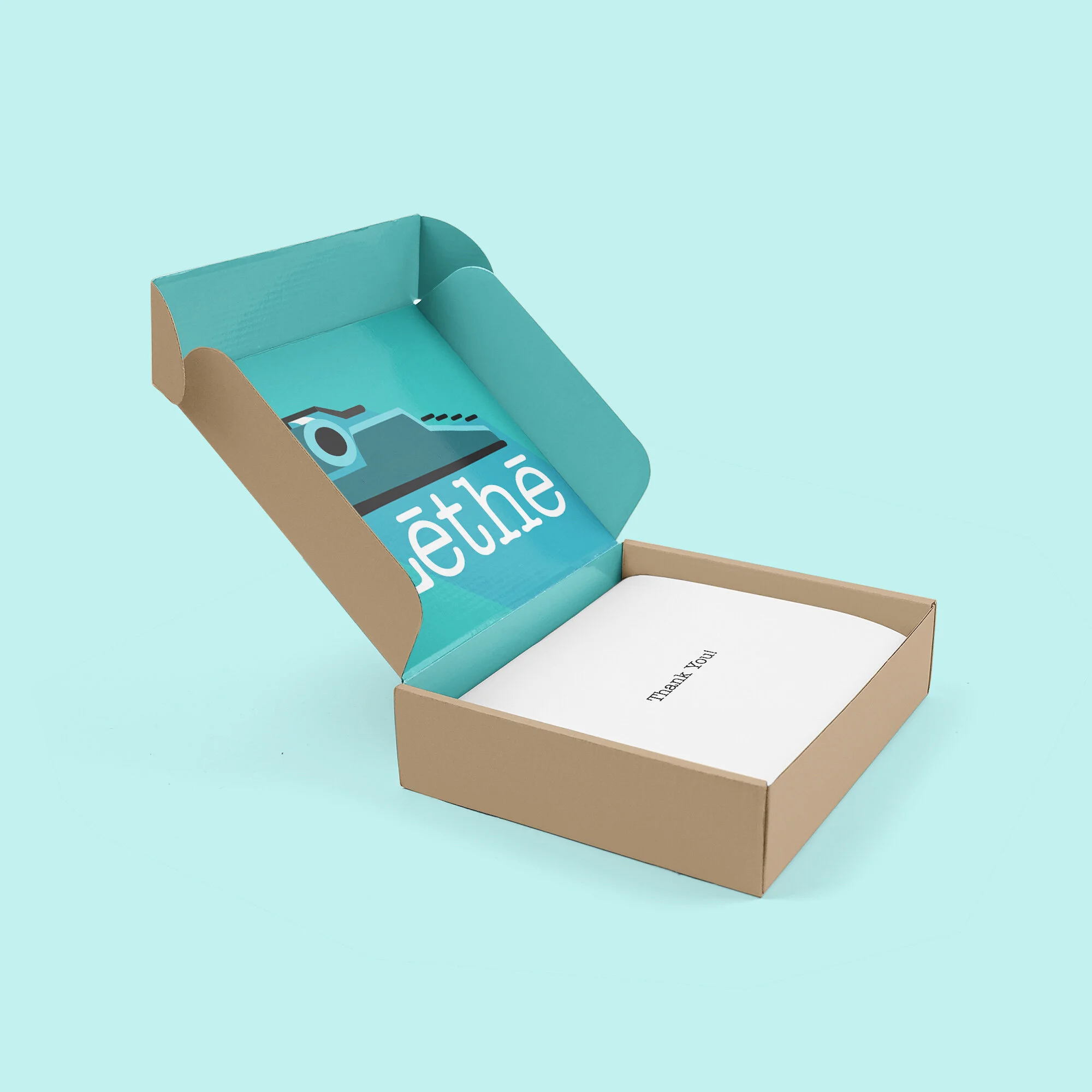
Packaging boxes, large for type writers and the smaller boxes would be used for small parts and replacement ribbons.
Promotional bags that would be available for purchase on the online store or app, it would also be given as a gift for orders.
Marketing Strategy
Brand Positioning Statement: Lethe is about connection, from connecting the old and the new, connecting to your inner peace, or connecting with others. With Lethe it is about connecting with ourselves and others allowing you to create your own story.
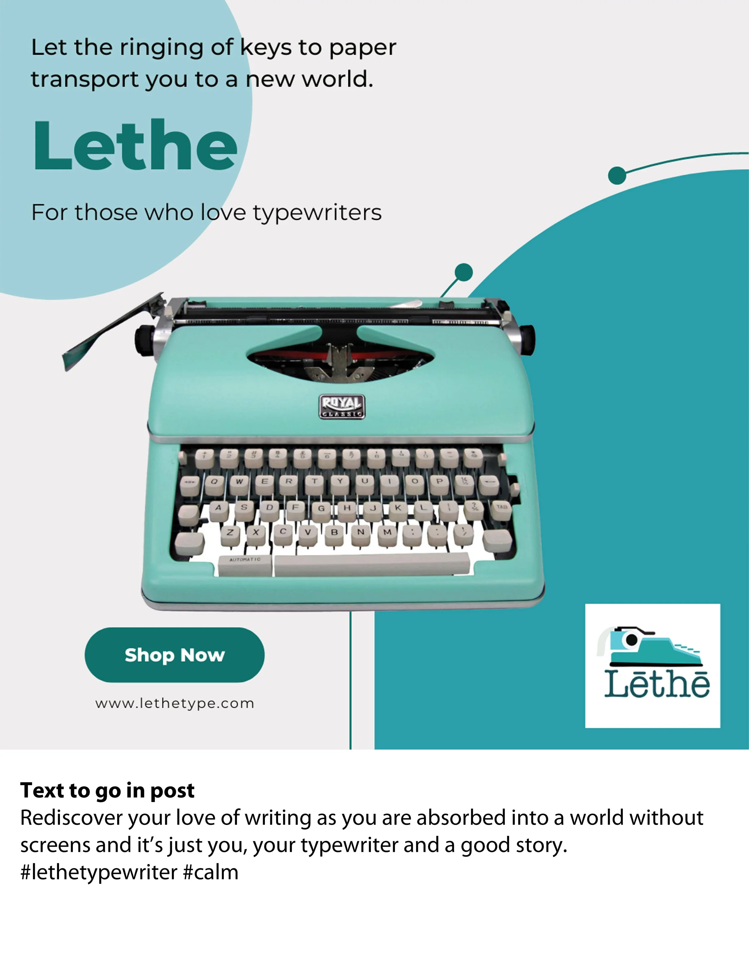
Tagline: For those who love typewriters.
Social Media Posts
Social media video promotion


